MIETTE
Miette is a neighbourhood bakery built around warmth, ritual, and good bread.
This brand was designed as much as it was baked. :) From the beginning, the idea was to create a bakery that feels familiar and comforting, a place you return to every day without thinking twice.
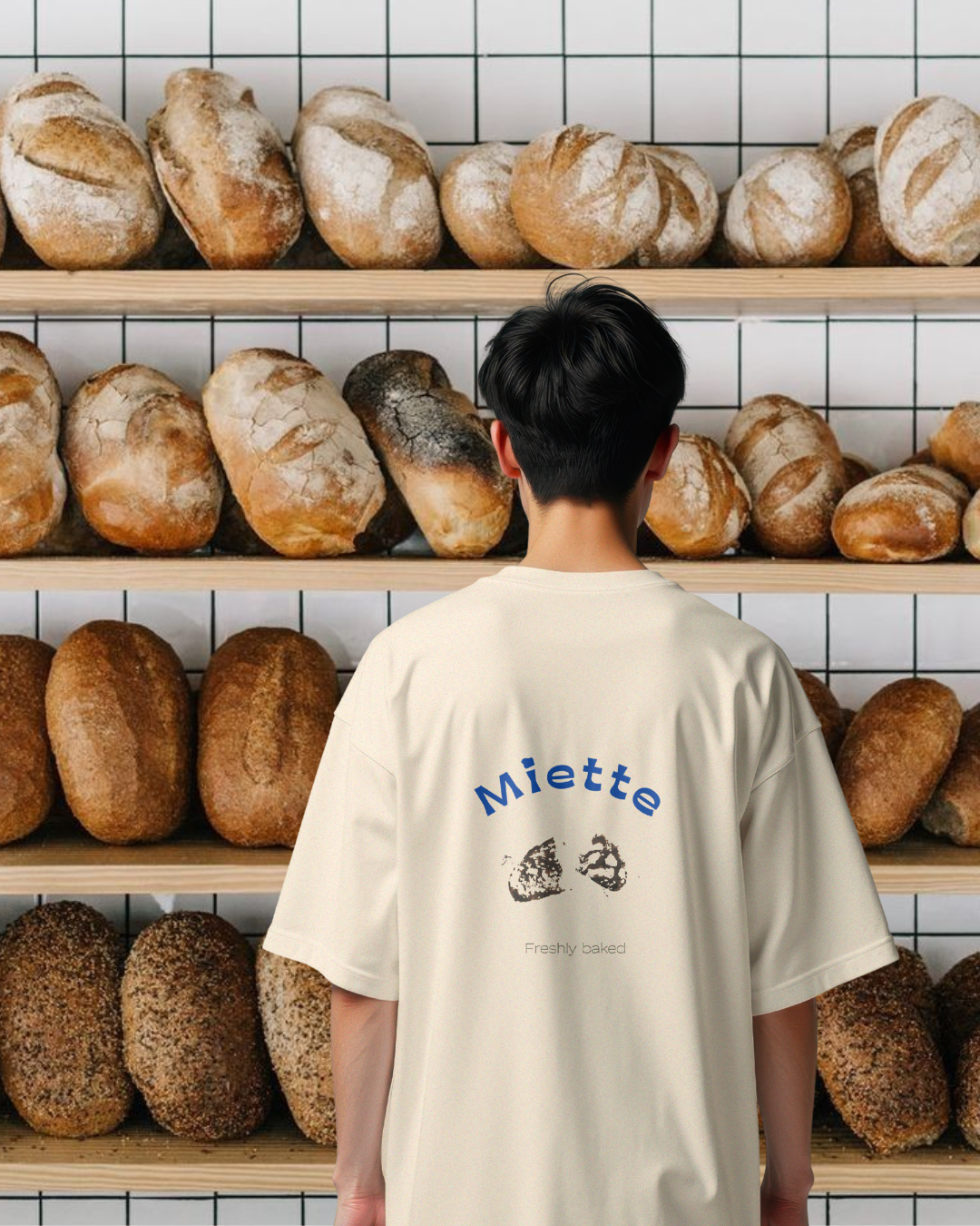
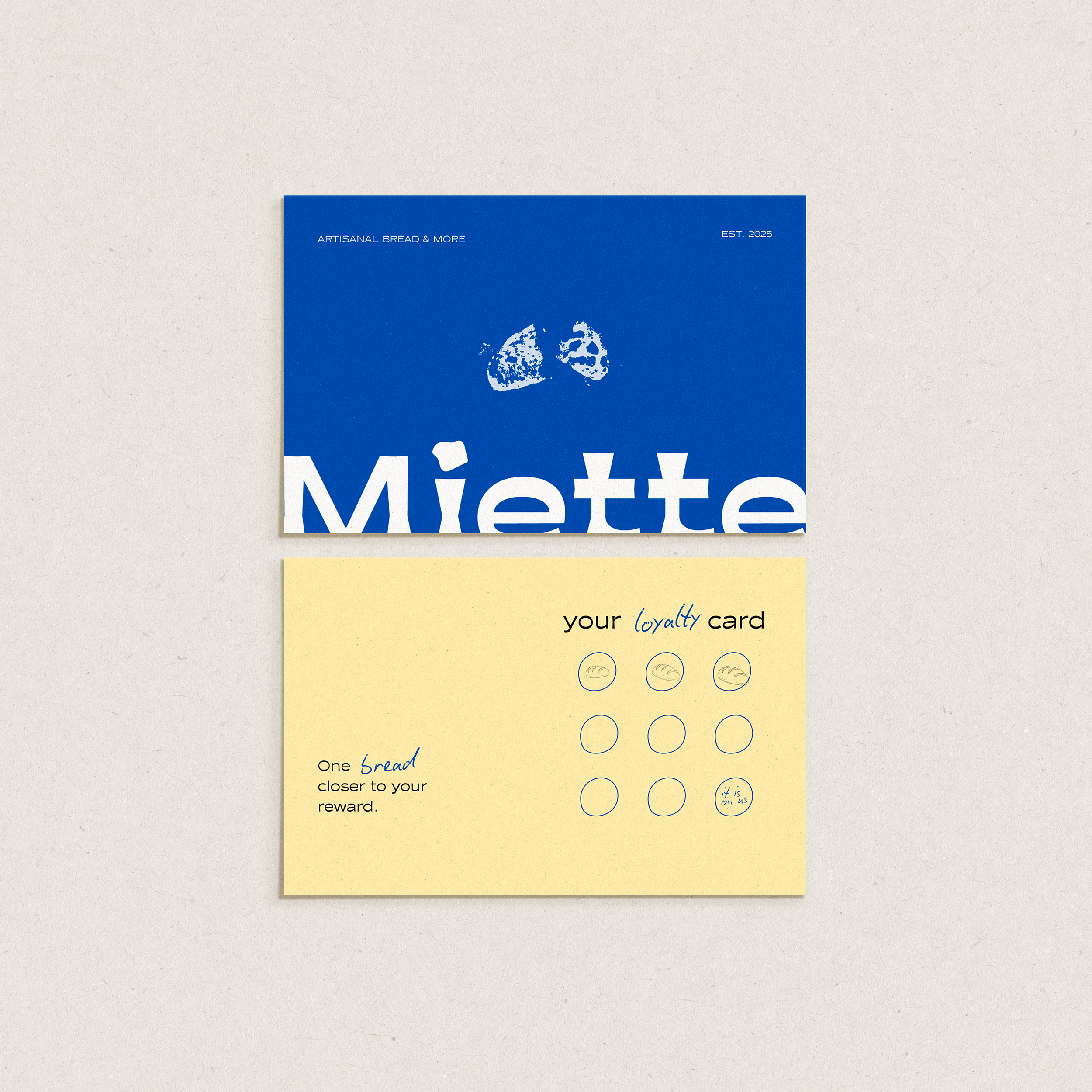
Its chunky typography reflects what it stands for: something generous, grounded, and reassuring. A place that feels familiar from the first visit, where the smell of fresh sourdough pulls you in and the counter feels like part of your daily route.
The name comes from the French word miette, meaning crumb. That small trace of bread being shared. That notion shaped the brand: sourdough made to be part of daily life. Honest, fresh, and quietly essential.
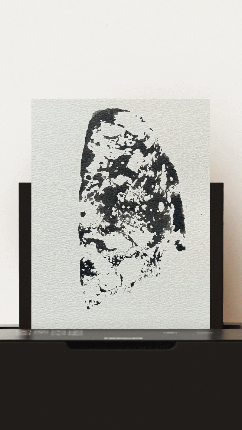
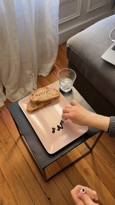
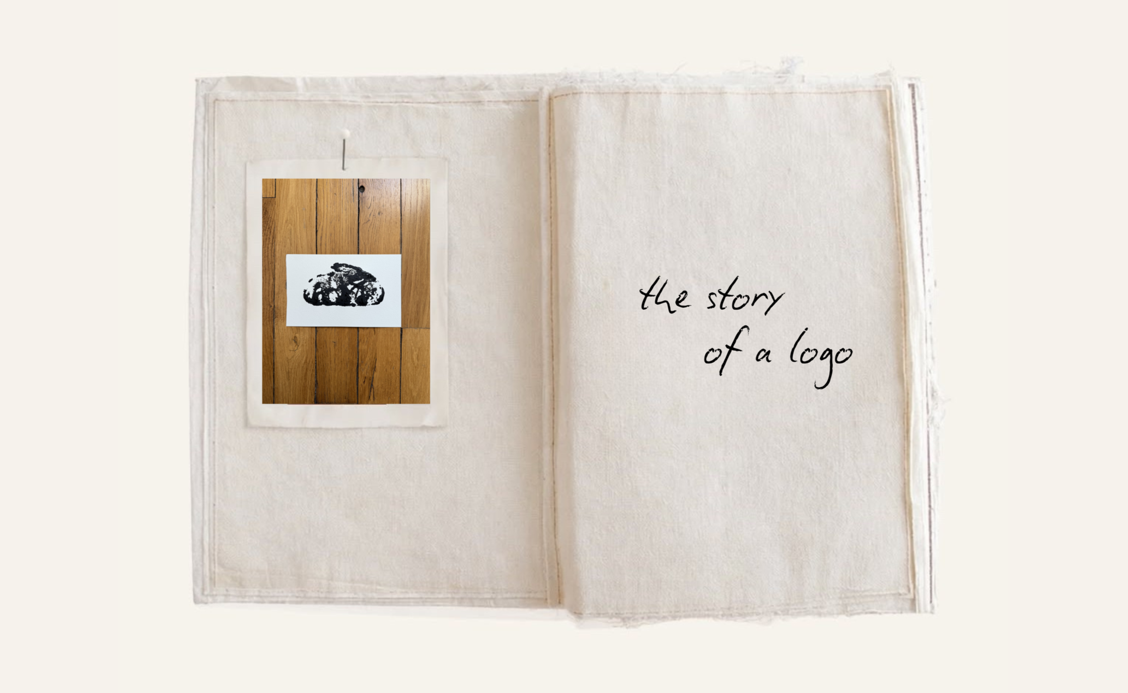
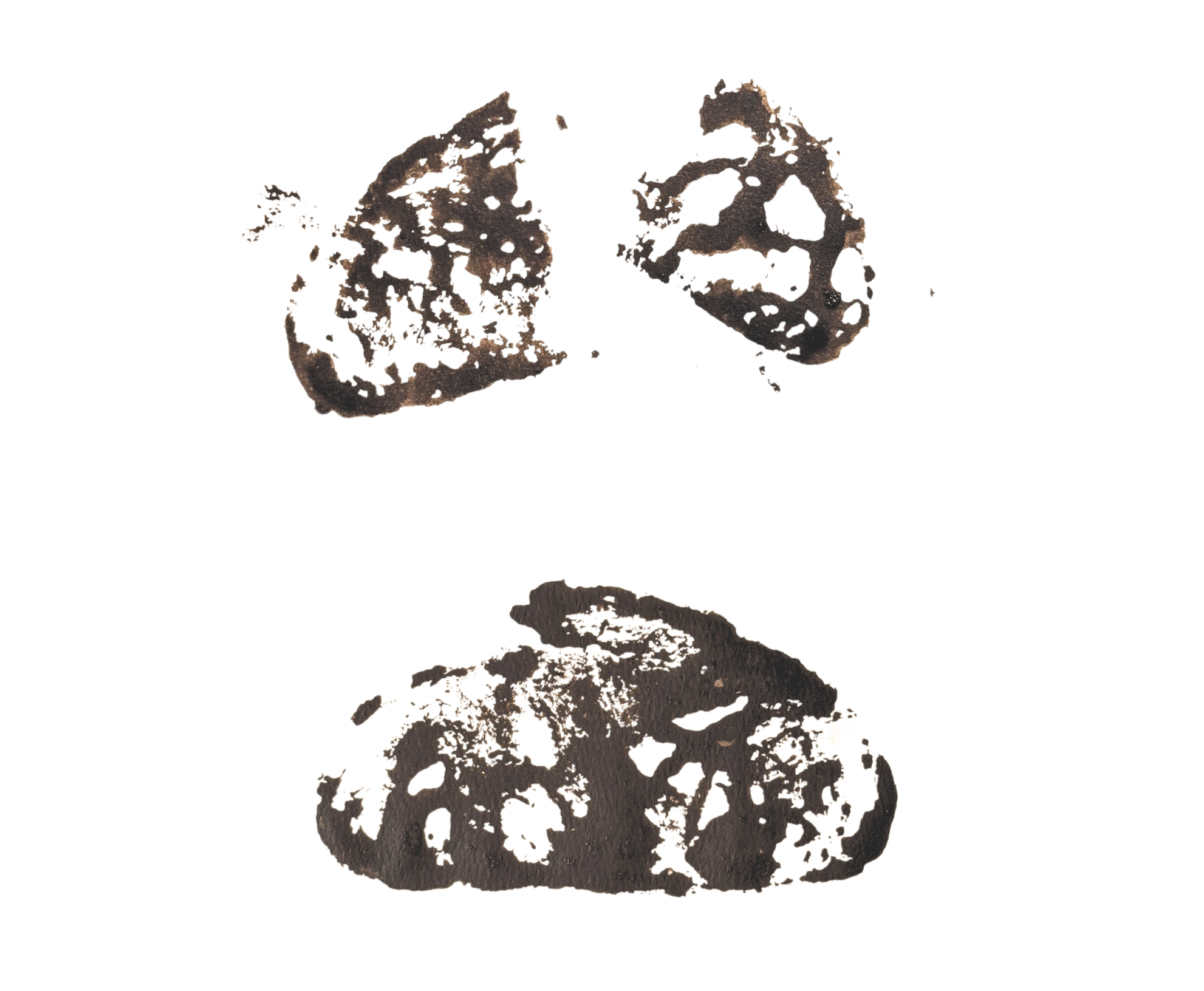
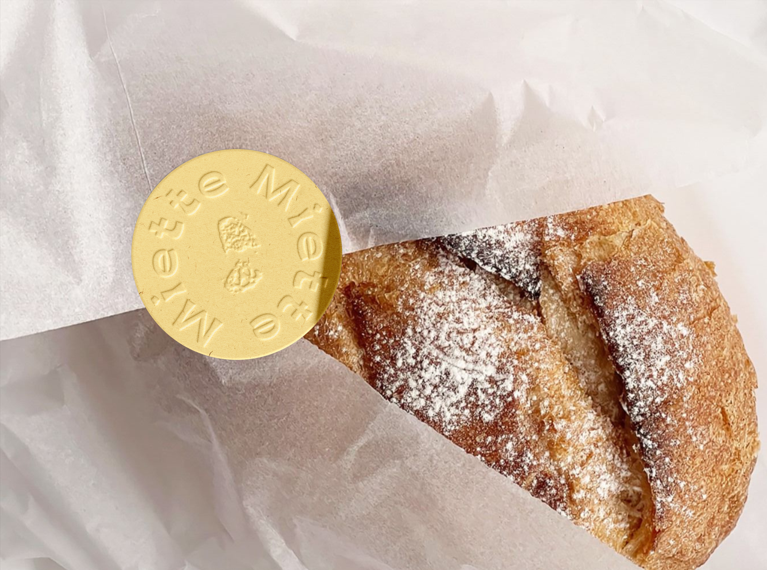
The visual identity was built by hand. The logo was created using a real slice of bread, pressed into ink to form a stamp, then digitalised. The texture, irregularities, and softness of the imprint were preserved intentionally. This approach reflects how Miette thinks about branding: tactile, imperfect, and rooted in real raw materials.
We wanted to bake a story where both the product and the identity feel human, warm, and enduring. The result is Miette - built around simple things done well: fresh bread, warm spaces, and the quiet comfort of everyday rituals.
Services
Brand Strategy
Brand Narrative and Verbal Identity
Logo, Naming and Brand Architecture
Visual Identity Design
Photography style and Imagery
Colour System
Typography System
Client
Miette
Date
February 2026


Love what you see?
The next chapter belongs to your brand.